
2nd Quarter 2020: On the Shape of Things to Come
Dylan B. Minor PhD, MSBA, CFP®, ChFC, CLU
Chief Strategist and CIO
This quarter I have had some client questions about the “shape of the recovery.” That is, many are wondering what the economic recovery will ultimately look like, and by corollary what stock markets might look like.
To begin such a discussion, it is important to offer a few quotes over time that show just how hard it is to predict the future:
“Louis Pasteur’s theory of germs is ridiculous fiction.” Pierre Pachet, Professor of Physiology at Toulouse, 1872
“Everything that can be invented has been invented.” Charles H. Duell, Commissioner, US Office of Patents, 1899
“Stocks have reached what looks like a permanently high plateau.” Irving Fisher, Professor of Economics, Yale University, 1929
“I can assure you that data processing is a fad that won’t last out the year.” The editor in charge of business books for Prentice Hall, 1957
“We don’t like their sound, and guitar music is on the way out.” Decca Recording Company rejecting the Beatles, 1962
“We’ve never had a decline in house prices on a nationwide basis. So what I think is more likely is that house prices will slow, maybe stabilize: might slow consumption spending a bit.” Fed Chair Ben Bernanke, July 2005
Despite a rich history of bright people making such poor predictions, I will hazard a discussion around the future of our economy. To do so, it is helpful to review the shorthand we economists often use to speak about an economic recovery. What follows are some examples of historic US recessions and how we categorize each recession by a letter of the English alphabet. All data is from the Federal Reserve and US Bureau of Economic Analysis.
We begin with the infamous W (shaped) recession, which is a recession that leads to a short recovery, only to fall into recession again. A classic case of this is from the early 1980’s:
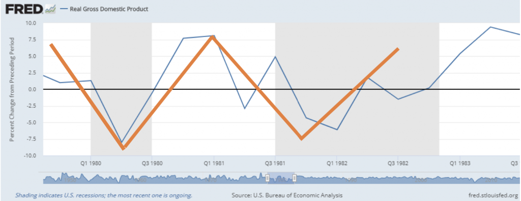
The blue line reports the quarterly change in US economic output, as measured by the Gross Domestic Product. The gray shaded sections capture the official periods of recession. I added the orange lines so one can see the idea of a W without having to squint.
The next type of recession is called a U, as it takes a bit longer to hit bottom and to recover. We saw an example of this in the mid-1970’s:
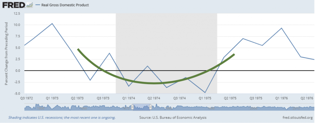
Here the green line traces out the trajectory of the recession.
The least worst of all recessions is called a V, as the economic drop and recovery are both swift. One period we witnessed this was in the early 1990’s:
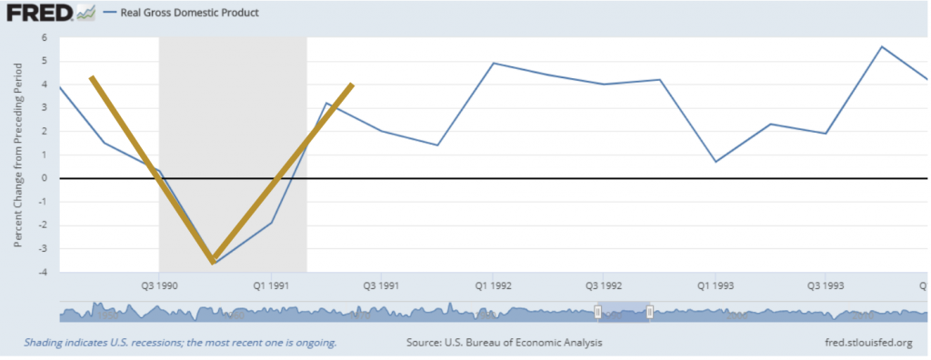
Notice this recession only lasted a couple of quarters, whereas the previous U was over four quarters. Here, the mustard-colored line traces out this gentler recession.
One can imagine that there are all kinds of possible shapes to a recession, especially if we squint enough and add a good dose of imagination—kind of like cloud-gazing. I have heard talk of an L recession, which suggests the economy drops precipitously and never recovers. However, this is a bit of a mythical idea: At least for developed markets, such as the US, this has never happened in history. On the other hand, I was thinking it might be interesting if we documented an M recession, which we could simply call a Minor (!) recession. This is where we enjoy an economic speed bump just before and after tranquil times. Unfortunately, this shape hasn’t yet caught on with other economists.
But what about our current time? Well, we were happily bobbing along until the Coronavirus struck. Most developed nations responded by greatly restricting economic activity (formally and/or voluntarily), creating one of the swiftest slides into recessions ever recorded. Here is what it looks like so far:
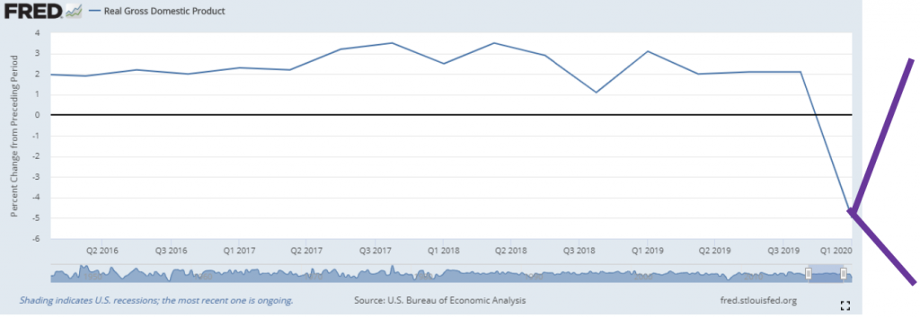
If this chart looks scary, it is because it is. At this point, returning to my earlier quotes, we really don’t know where this recession will go, as I indicated with the potential purple lines above. We will all but for sure have a very large drop in GDP for the 2nd quarter (note the above chart is only through the 1st quarter of 2020)—some estimates range from 25-33% annualized contraction in 2nd quarter GDP. After that exciting quarter, we could have much more to fall, be levelling out, or already be on our way back to the “good old days” pre-COVID 19.
To try and figure this out we often look to indicators of economic activity. One of the more helpful indicators we look to is the economic activity in the areas of services (i.e., non- manufacturing). When this indicator reports a number greater than 50, this suggests economic expansion, whereas below 50 suggests contraction:
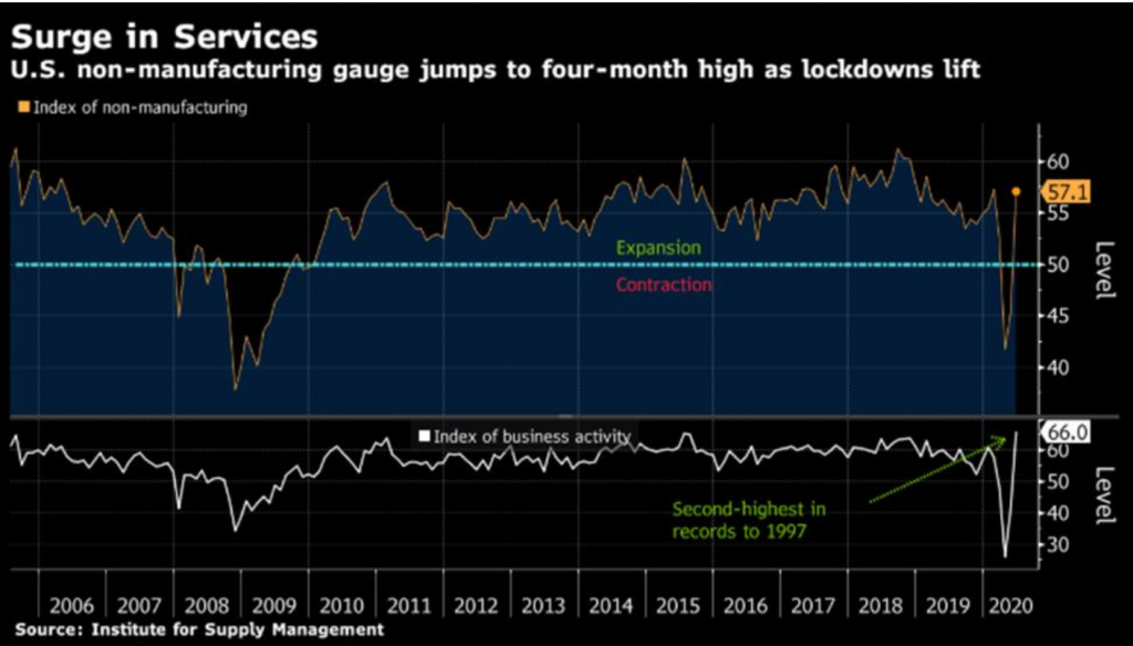
Compared to 2008, this activity makes the current recession look like the sharpest V on record, should the overall economy conform to this pattern. Of course, this could also be the beginning of a W, as well, if not an M.
In addition, to various indicators of economic activity, possibly one of the most important leading economic indicators, which helps predict the future of the economy, is the stock market itself. Here is how this looks thus far this year for the US setting, as reported by Bloomberg:
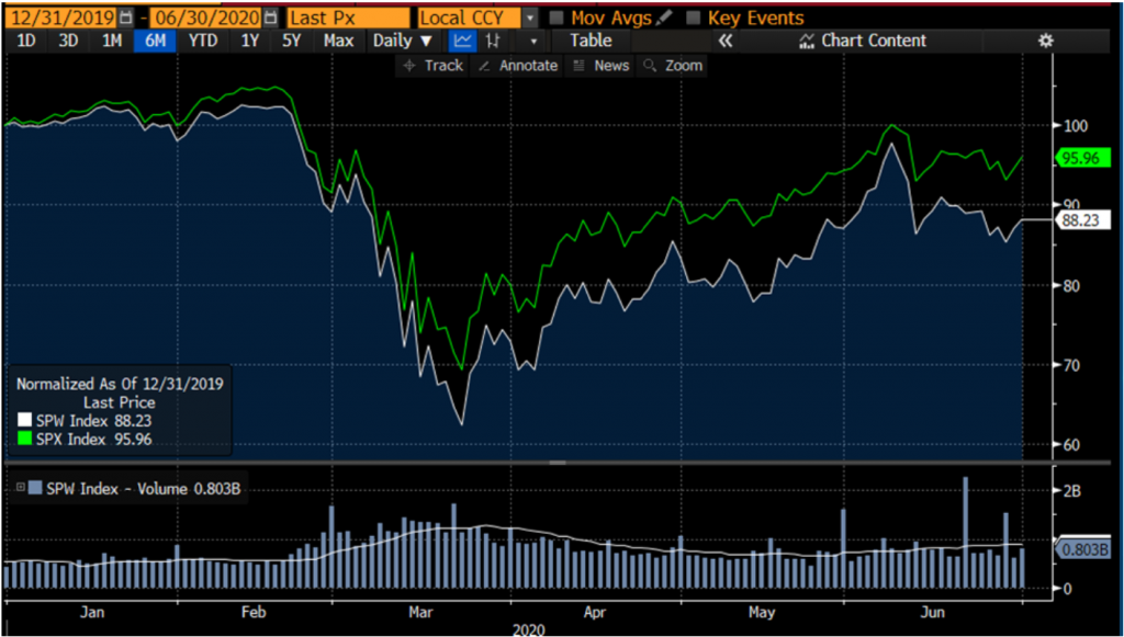
The green line on the chart is the value of the S&P500 starting the 2020 year with a value of 100. The light-blue line below the green line represents an equal-weighted version of the S&P500, which is more representative of the underlying companies, since each company has an equal weight in the index as opposed to the more often quoted S&P500 (i.e., the green line in the above chart), which is cap-weighted. This means the largest companies carry a larger weighting in the index. Currently, the top 5 companies of the index (i.e., Microsoft, Apple, Amazon, Facebook, and Google) represent about 22% of the index, which is also a historically high level of concentration; the index has almost become a five-company index.
This chart shows us that a more representative index carrying an equal-weighting of the roughly 500 largest US companies, one would be down about 12% for the year (88.23 from 100). This mix of companies fell a breathtaking ~40%, before starting to recover. This severe drop did well to predict our current historic period of unemployment and economic malaise.
So what is the shape of this stock market indicator, which we can use to predict the shape of our economic recession? Based on the above chart, it was looking like a V, but then with a new increase in coronavirus cases and thus increase in lockdowns (formal and informal), it might become a bit more of a W. However, only time will tell how much the current pullback in activity might hurt the economy.
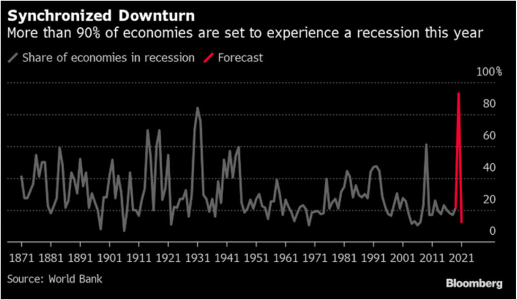
For what it is worth, globally, it looks like this year is going to end up being the worst economic year on record (at least for the past 150 years). In terms of the percentage of economies now
stuck in an economic downturn, we are to reach unprecedented levels. The following is a chart from the World Bank:
It turns out that most of the economic numbers are often reported much longer after we have already experienced what they are reporting. Although this data helps to memorialize recessions and growth, it is not too helpful for looking to the future. Thus, my students often ask me: Can’t we find some economic indicators like the stock market that tell us what is going on now so we can better know where we are going and even what we should do?
The good news is in today’s tech-centric world, there are some such indicators. One commonly used measure is simply looking at Apple phone location data. All of you iPhone users are happily providing great data on the economy, especially since you rarely leave home without your phone. In particular, companies can now buy data from Apple that track how often you are going to stores, to work, or simply driving around more. Using the data of many iPhone users, we can see that in the US we are currently at 133% of the driving level compared to before the pandemic. That is, the average person in the US is now driving 33% more than before the pandemic. In other parts of the world, driving is at even higher levels. This is illustrated in the below chart, which reports since February how much people in different countries are driving, normalized to the level of driving on January 13th of this year.
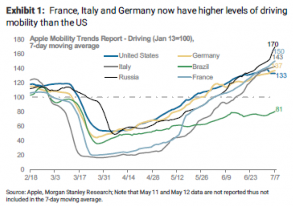
At this point, one might wonder if it is also the case that people are driving more now versus taking public transportation. In the US there is some truth to this, which means the recovery is overstated when only looking at iPhones being driven around. However, in Europe, even public transport has generally recovered, as well as some commercial trucking in some countries. This all bodes very well for the European economic recovery. In contrast, for example, our public transportation in contrast is still at 50% of the pre-pandemic levels.
In terms of investing and looking to the future, this data and other data suggest we will witness a near-term period of international stock outperformance versus US stock performance. In fact, we could be witnessing the beginning of a longer period of outperformance, similar to the first decade of the 21st century. This would average out the past decade of international underperformance relative to the US. So it is that we currently have meaningful exposure to Europe, should this prove to be true. Of course, if the US again reigns supreme in stock markets, we are still maintaining adequate US exposure.
This idea of relative recovery relates to a broader and important point: to navigate times of uncertainty, it becomes essential to have different investments that really do work differently at the same time. This is a cornerstone to Omega Financial and our unique States of the World Wealth Management® process. The good news with this approach is that most every year you should have some investments losing money and some investments making money. Making money is good news. But losing money, if handled strategically, is also helpful for taxable accounts for tax harvesting, as appropriate. Variation in returns is also crucial for our
“rebalancing bonus” where we can sell investments high and then buy other investments low— it’s hard to do that if everything goes up and down together. The greater the variation across investment returns, the greater the extra return from rebalancing, all things equal.
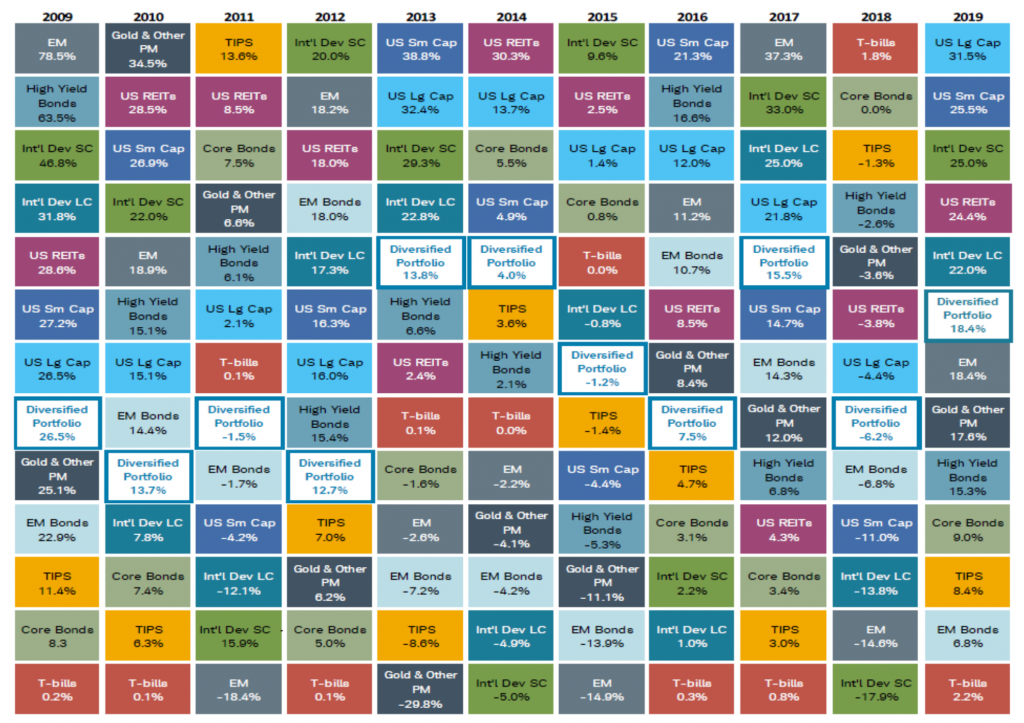
The following page provides a chart from Morningstar that shows an example of some of the most common asset types and how returns for each varies year-to-year. In particular, each year’s row has the highest returning asset at the left and then all others to the right of that in descending order of annual returns. The most remarkable feature of this chart to me is how there is no clear winner each year. For example, for 2019, the best performing asset was US Large Cap at over a whopping 31%. The previous year this investment class lost over 4%. Instead, treasury bills topped 2018 returns with a meager return of roughly 2%. However, it was the worst performing investment the previous year in 2017 with a gain of less than 1% while Emerging Market stocks jumped in value by over 37%.
So in short, we should not become too anxious about what the next quarter holds in terms of the economy or a given country’s stock market. Instead, I suggest you spend your time sounding clever with your family and friends. When any of them ask what’s going to happen, you can simply quip that it’s going to be a [fill in your favorite letter]-shaped recovery. Because there will be a recovery—in fact, there is already some recovery. My best guess is that in the US we are in the midst of an M-shaped recovery. Nevertheless, more wildcards we have include our coming election and reignited trade wars, so stay tuned for more information to come on these developments.
All the while, we have been busy at work on your behalf at Omega Financial, harvesting tax savings, where appropriate, rebalancing assets classes, and reviewing positioning to help you best ride the recovery based on your own needs, goals, and risk preferences. In addition, we have been reviewing the continual changes in tax laws, fiscal stimulus, and regulations to see where else we might have another opportunity to better tie together all of the pieces of your financial puzzle.
In the meantime, before our next review together, should you have any questions or concerns please do not hesitate to reach out to any of us here at Omega Financial.
Omega Financial Group LLC is a Registered Investment Adviser. This commentary is solely for informational purposes. Advisory services are only offered to clients or prospective clients where Omega Financial Group LLC and its representatives are properly licensed or exempt from licensure. Past performance is no guarantee of future returns. Investing involves risk and possible los of principal capital. No advice may be rendered by Omega Financial Group LLC unless a client service agreement is in place.